Bilingual Brand Identity in Saudi Arabia: What a Real Identity System Includes
What a brand identity in Saudi Arabia should include, why Arabic and English must be designed together, the process step by step, and how to judge the result.
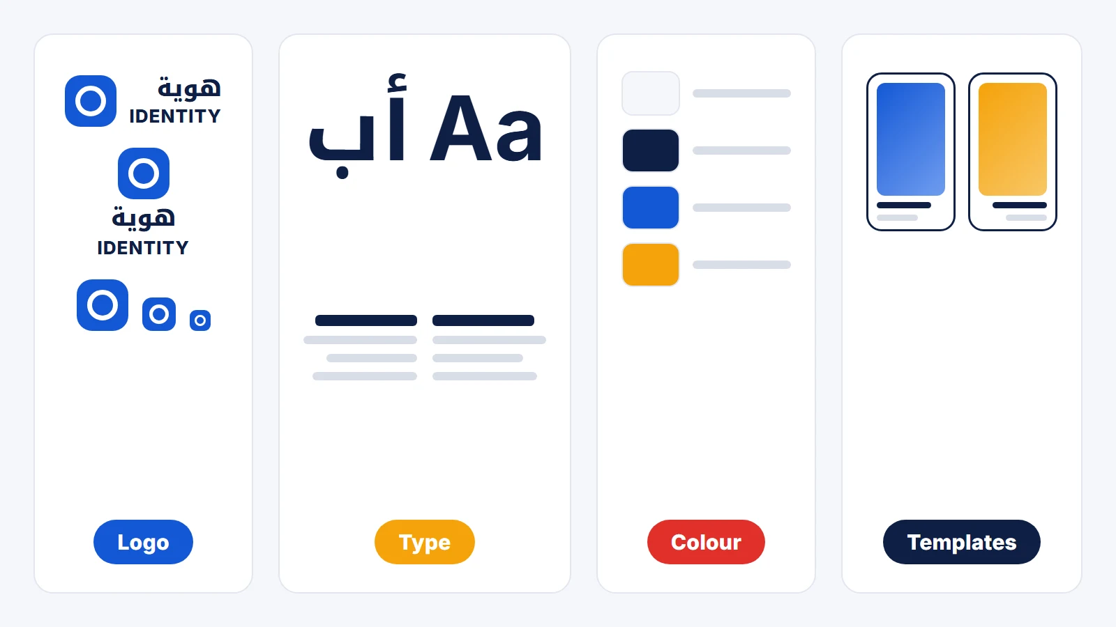
A brand identity in Saudi Arabia is a system of decisions, not a logo file: the wordmark in both Arabic and English, the type pairing, the colour roles, the templates, the applications the business actually produces, and the written rules that keep all of it consistent once other people start using it. Most identities fail in one of two places. The Arabic is treated as a translation of the English, or the system stops at the logo and the team improvises everything after it.
This guide covers what a complete identity includes, why the bilingual part is its own design problem, how the process runs, and how to judge what you receive before you sign off on it.
What a brand identity actually includes
A useful test: could a new designer, a printer and your social media team produce work tomorrow that looks like it belongs, without asking anyone? If the answer is no, you have a logo, not an identity.
A complete identity system covers six things:
- The logo and its full lockup set. Horizontal, stacked and icon-only versions, plus the minimum size each one survives at. A logo that only works large is a problem the first time it goes on a delivery-app thumbnail or a favicon.
- Bilingual typography. An Arabic typeface and a Latin typeface chosen to sit together, with defined weights for headings, body text and small print in both scripts.
- A colour system with roles. Not just a palette, but which colour is for backgrounds, which for text, which for actions and highlights, and which combinations pass contrast. Without roles, every designer reinvents the hierarchy.
- Templates the team will really use. Social posts, stories, reel covers, presentation slides, price lists: the repeat formats your business publishes every week.
- Applications. Menus, packaging, signage, uniforms, stationery, vehicle graphics: whatever the business genuinely produces. For restaurants and hospitality, these are often where customers judge the brand, so they belong inside the system.
- Guidelines written as working rules. What to do, and just as important, the mistakes to avoid, shown with examples.
Why Arabic and English have to be designed together
Most identity systems are designed in Latin type first, with the Arabic added afterwards. That is why so many Saudi brands have an Arabic wordmark that feels like a caption under the logo rather than part of it.
The two scripts behave differently in ways that matter for design:
- Arabic is connected and contextual. Letters change shape depending on their position in the word, so a wordmark cannot be built by swapping letters one for one the way a Latin logo sometimes is.
- The proportions differ. Arabic has tall ascenders, deep descenders and a different visual weight distribution, so an Arabic and a Latin word set at the "same" size rarely look the same size.
- Direction changes layout, not just text. In an Arabic layout the reading order, the alignment, arrows and progress indicators all mirror. A template designed only left-to-right breaks when the Arabic version is produced.
- Small sizes are harder in Arabic. Dots and fine joins disappear first, which matters on menus, labels, app icons and the bottom line of a social post.
- Numerals are a decision. Arabic-Indic digits (١٢٣) or Western digits (123) for prices, phone numbers and dates: pick one per context and write it into the guidelines, or the menu and the website will disagree.
Designing the pairing deliberately means choosing typefaces whose weights and rhythm match, drawing or adjusting the Arabic wordmark as a design in its own right, and testing both at their smallest real size before anything is approved.
The process, step by step
A branding project that ends well usually runs in this order:
- 1. Discovery. What the business is, who it is for, what it competes with, and what should stay if there is already recognition worth keeping. This is where the brief gets written down and agreed.
- 2. Direction. Two or three distinct creative directions shown as moodboards and rough applications, so the decision is made on how the brand will feel in use, not on a logo floating on a white page.
- 3. Logo and type. The chosen direction developed into the Arabic and Latin wordmarks, the lockups and the type pairing, tested at real sizes.
- 4. System. Colour roles, graphic elements, photography and illustration style, and the templates.
- 5. Applications. The identity applied to the items the business produces, which is where most gaps in the system show up and get fixed.
- 6. Guidelines and handover. The rules written down, with source files organised so the next person can find what they need.
Where a business already has an identity that customers recognise, the work is often a refresh rather than a replacement: tightening the typography, defining colour roles, rebuilding the templates and writing the rules around the mark that already exists.
What to prepare before you brief an agency
The better the brief, the less time goes into guessing. Before the first meeting, it helps to have:
- The name in both languages, final. Spelling, transliteration and whether the Arabic and English names are the same word or two different names.
- Your audience in one or two sentences. Who buys, where they first meet the brand, and in which language they mostly do it.
- Three to five competitors and what you think they get right or wrong.
- What must stay, if you are refreshing: a colour, a symbol or a name customers already know.
- The list of applications you produce, from menus and packaging to social formats, so the scope covers what you actually need.
- Trademark checks done early. Registration with the Saudi Authority for Intellectual Property (SAIP) is a separate step from the design, and it is cheaper to discover a conflict before a logo is final than after it is printed.
How to judge the identity you receive
Before signing off, test the system instead of only looking at it:
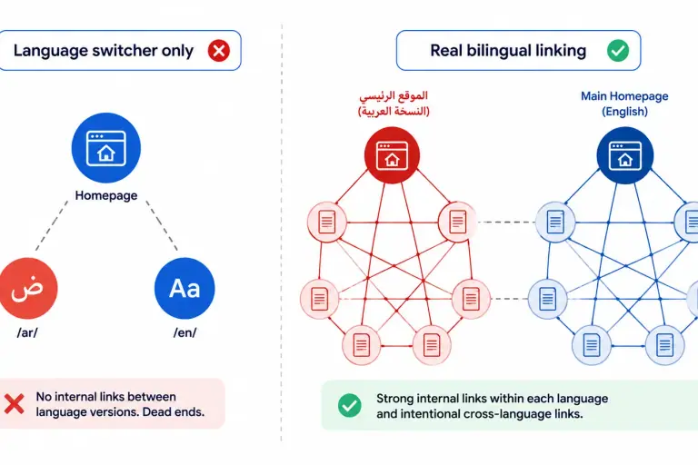
- Put the Arabic and English logos side by side at the smallest size you will use. Do they feel like one brand, or one brand and a translation?
- Ask someone outside the project to make a social post using only the guidelines and templates. Where they get stuck is where the system is missing a rule.
- Print the menu, the label or the business card. Colours and fine Arabic details behave differently on paper than on screen.
- Check that every file you need exists in usable formats: vector logos, the font licences, and editable templates.
A good identity makes the next hundred pieces of work easier. That is the standard to hold it to.
Where nibras fits
nibras designs bilingual identity systems for Saudi businesses, from new brands to established companies whose visual language has drifted across teams. The details of what we deliver are on our branding and visual identity service page. Because an identity is judged in use, it usually connects to the next steps: social media management that applies it every week, and photography and video production that gives it real images to work with.
Frequently Asked Questions
What is the difference between a logo and a brand identity? A logo is one mark. A brand identity is the whole system around it: the logo's versions and sizes, the Arabic and Latin typography, colour roles, templates, applications and written guidelines. The logo is what people recognise; the identity is what keeps everything else consistent with it.
Should the Arabic and English logos be designed at the same time? Yes. Arabic and Latin scripts differ in proportions, weight distribution and how they hold at small sizes, so an Arabic wordmark added after the English one usually reads as a translation rather than part of the brand. Designing both together lets each be drawn properly while still feeling like one identity.
How long does a brand identity project take? It depends on scope: a logo with a small type and colour system is much shorter than a full system with packaging, signage and detailed guidelines. The stages that most often add time are approvals between directions and the applications stage, so agreeing the brief and the list of applications at the start is the best way to keep the timeline predictable.
Can an existing identity be refreshed instead of replaced? Yes. If customers already recognise a colour, a symbol or a name, that recognition is worth keeping. A refresh usually tightens the system around it: typography, colour roles, templates and rules, rather than starting over.
What files should we receive at the end of a branding project? Vector logo files in every lockup, colour values for print and screen, the font files or licence details, editable templates, the applied designs, and the brand guidelines document. If you cannot produce a new piece of work from the files you received, something is missing.
The nibras newsletter
Practical articles on marketing, branding and search visibility, sent to your inbox. No spam, and you can unsubscribe in one click.

Want our new articles first?
Grow Your Brand in KSA
Work with nibras in Riyadh. Let our experts shape your strategy, premium content, and advertising campaigns for Saudi markets.